2022. AAIC came to us with a perception problem.
Their audience couldn't tell what was what. Was a given event THE conference, or one of many? Was the theme the brand, or was AAIC the brand? Everything blurred together. The question they brought us sounded like a logo question: do we need 12 logos for 12 sub-events, or is there another way?
It looked like a logo problem, but it wasn't.
AAIC, the Applied AI Conferences, runs different events on different verticals. Energy, agritech, fintech, space, and so on. Each one has its own speakers, sponsors, tracks, photography. Each speaker builds their own deck. Whatever we built had to handle all of that and still read as one company.
That's a system problem. And it's the one most brand identities quietly fail at.
What we built
The thing we kept saying internally: this brand has to hold even when people bad at visuals use it.
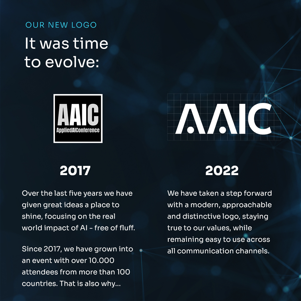
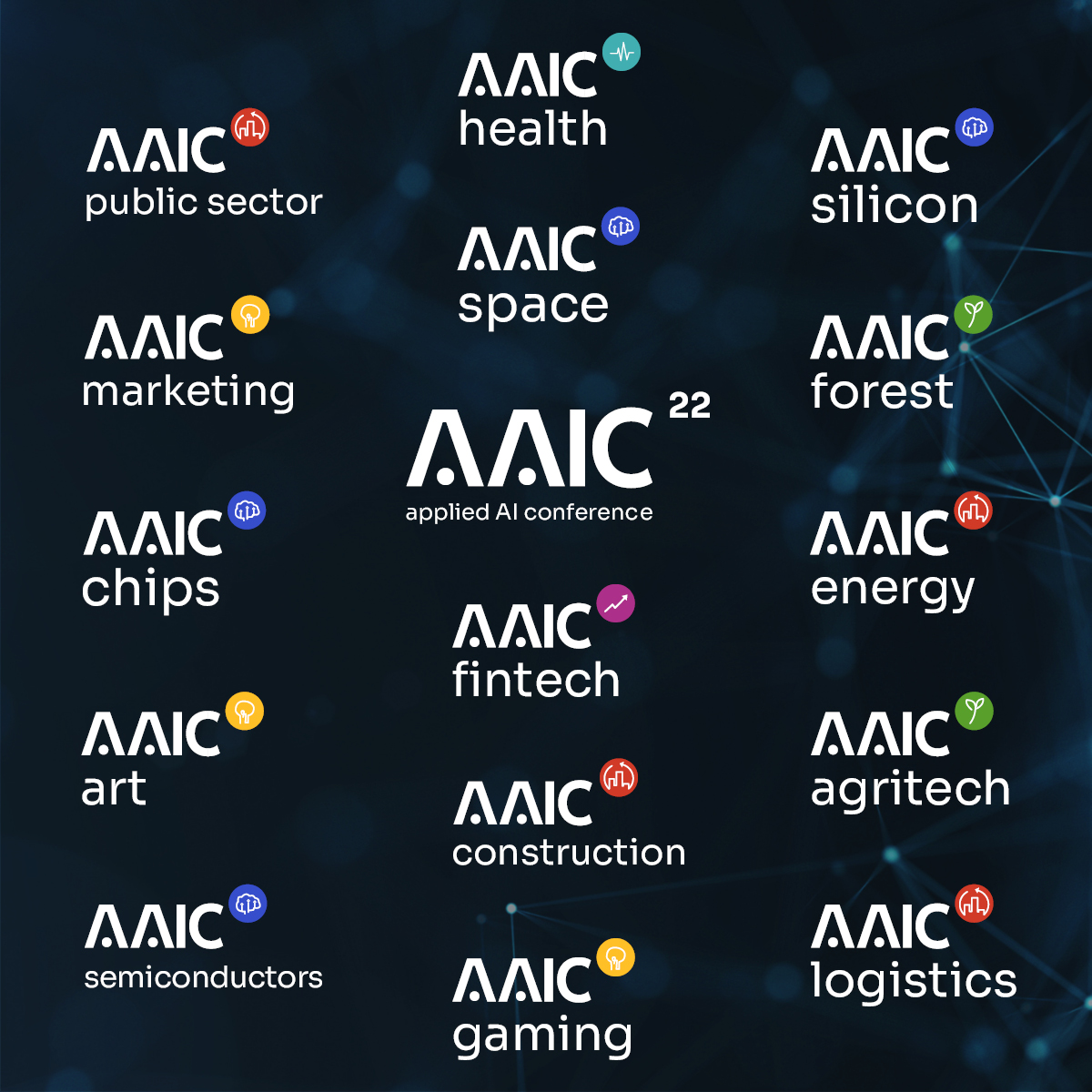
- One master mark, not twelve. A single AAIC identity with a small, disciplined modifier per vertical. The mark itself stays untouched across every edition. Energy, agritech, space, semiconductors, the rest. The umbrella never disappears, the topic is always clear.
- Master slides for speakers and workshops. Not "templates" in the polite design sense, but real building blocks. Sections, hierarchies, type pairings, image rules. Designed to be remixed.
- A construction logic with tolerance built in. Hierarchy that holds even when the grid breaks. If a speaker drops the structure by 20%, the slide still reads as AAIC. If they drop it by 60%, it still reads as part of the family. That tolerance is the whole point.
What happened
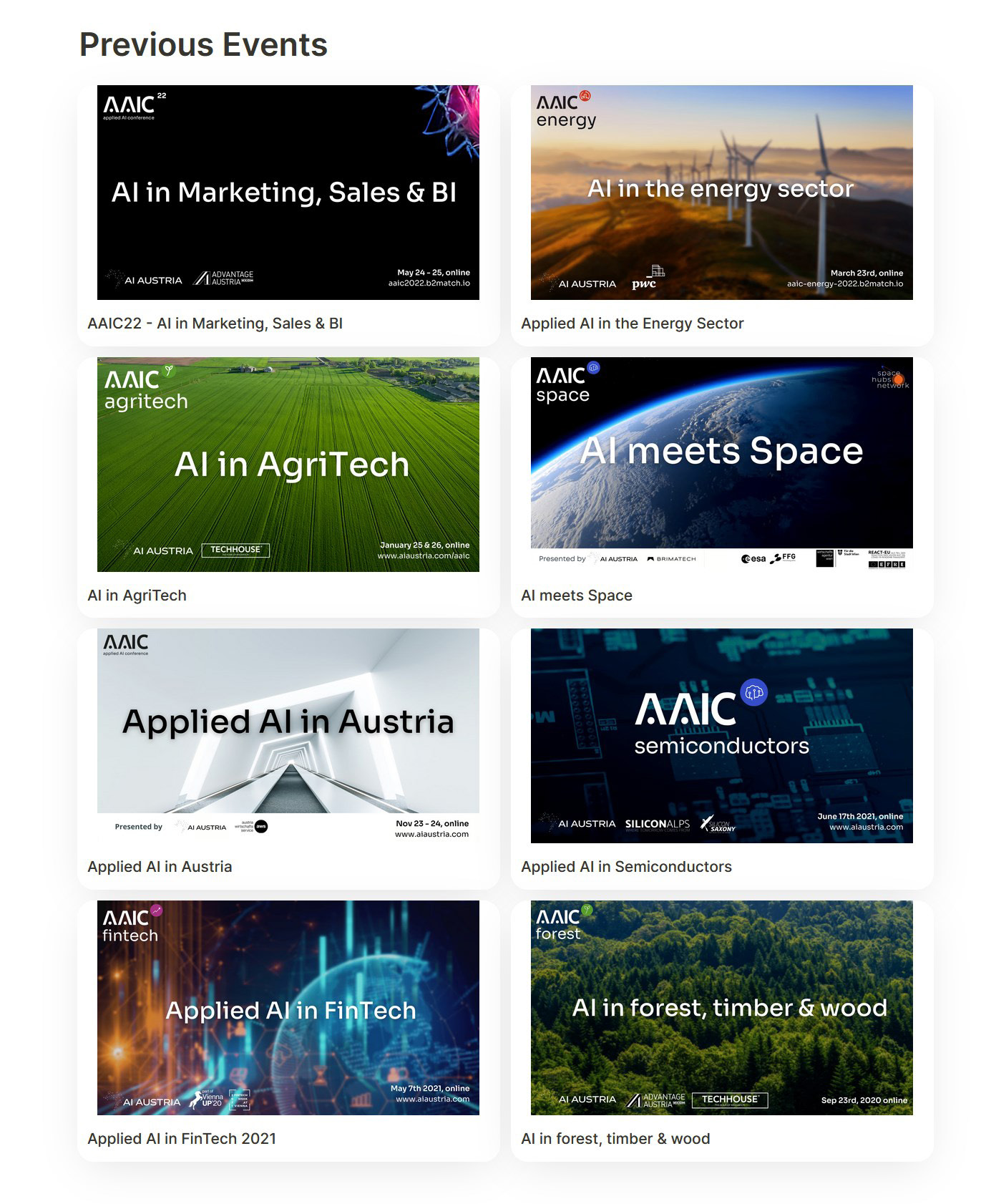
Since 2022, the AAIC brand has carried new editions across radically different verticals. Energy. AgriTech. Space. Semiconductors. FinTech. Forest, timber and wood. Logistics. Manufacturing. Different colors, different photography, different topics. Same brand.
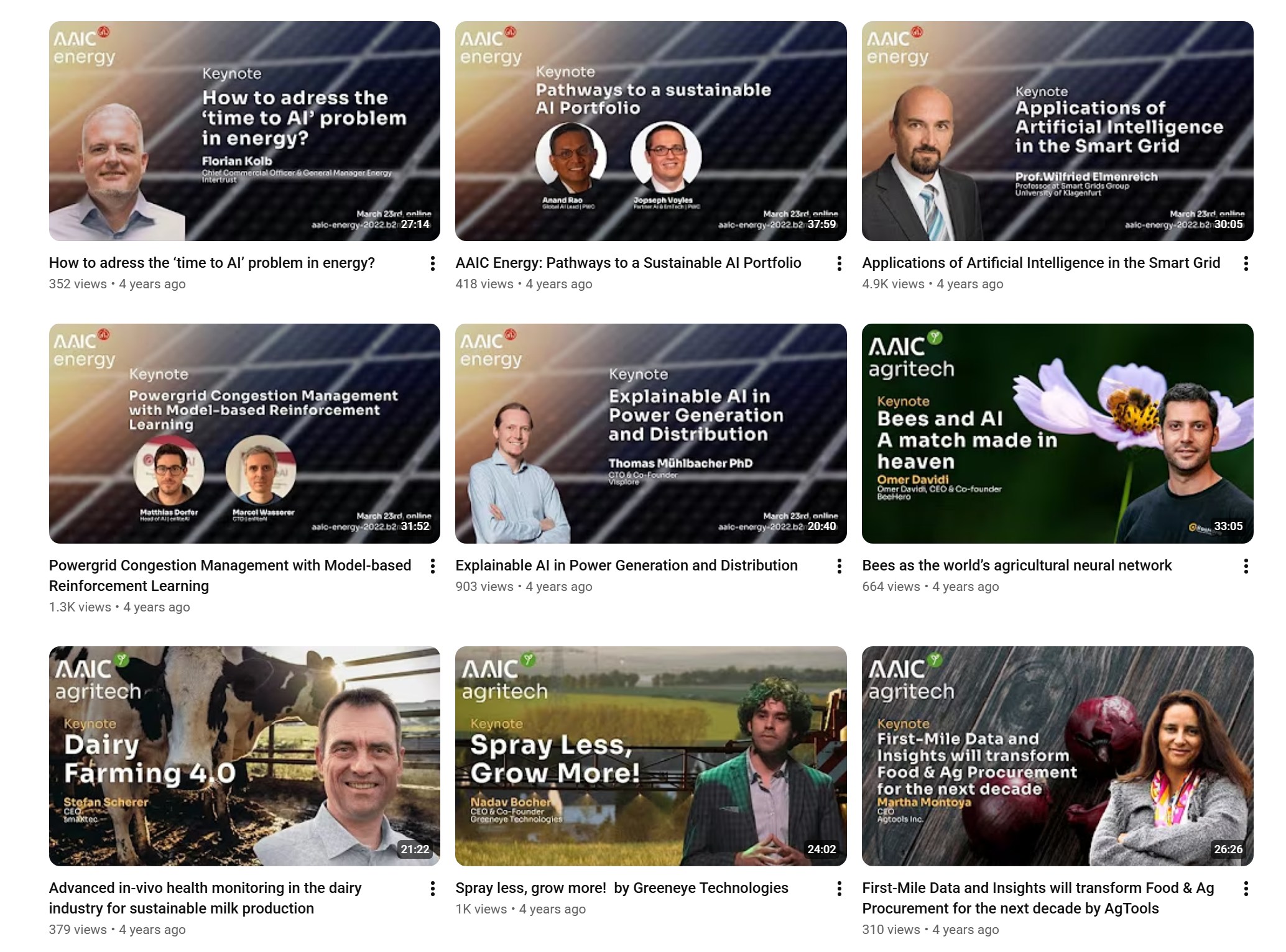
Speakers built their own presentations and keynote thumbnails from the master slides. Most touched the layout and some even broke it. The brand still reads as one company across every event, every speaker, every year.
AAIC isn't a commercial conference. It's a knowledge-exchange platform. So the receipt that matters here isn't revenue. It's whether the system stayed coherent across years of free-form use. It did. Since 2018, what started as a single Austrian event has grown into 15 editions and counting, with 70+ speakers and over 10,000 participants from more than 100 countries. The brand built in 2022 has carried all of that, without needing a refresh.
Four years on, the system is still in use. The next AAIC runs in September 2026, still working from the kit we built in 2022.
The thing nobody talks about
Most brand identities are designed for the agency's own portfolio, not the client's actual life. They look beautiful in the case study, then degrade the moment the client takes the wheel.
A real brand system asks a different question. Not "how perfect can we make it?" Instead: what is the lowest bar at which this still reads as us?
Once you start designing for that question, the system gets simpler. Hierarchies sharpen. Rules get clearer about what matters and what doesn't. You stop hiding behind detail.
The deliverable is the same. Guide, templates, system. The intent is the opposite. One is built to be admired. The other is built to be used.
If your brand identity collapses the moment your sales team opens a deck, you have a portfolio asset, not a brand.